

NOT FOR EVERYONE

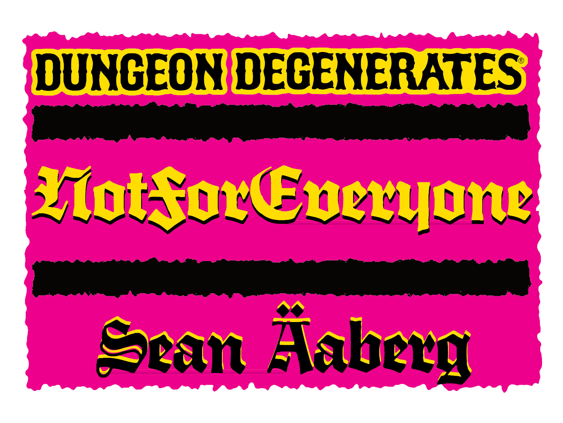
Most reviews of DUNGEON DEGENERATES start off with a warning that this is not a game, specifically an art style “for everyone”. Then the reviewer will talk about how they love it.
I have come to understand my work like a stinky cave cheese. Some people love it, but it really isn’t mild cheddar. However, it got me thinking, people are fine with & embrace exotic foods. What I go for is the visual equivalent of spicy food.
Think about it this way, every time you go & serve some of your favorite stinky cheese, you feel the need to apologize for your advanced taste. People are used to Mild Cheddar, but that kind of bland familiarity is the thing that should be apologized for.
“I’m sorry that I’m such a baby that I have evoked the blandification of society.” is what should be coming out of these people’s mouths. You should not apologize for having tastes that are spicier than the beige dungeon that mass appeal has pushed on us all.
This blandness is not expected in all corners. However, for some reason it is expected in board games. I’m still shocked that there have been NO visual clones of DD in the board game space. There have been a couple visually bold TTRPGS.
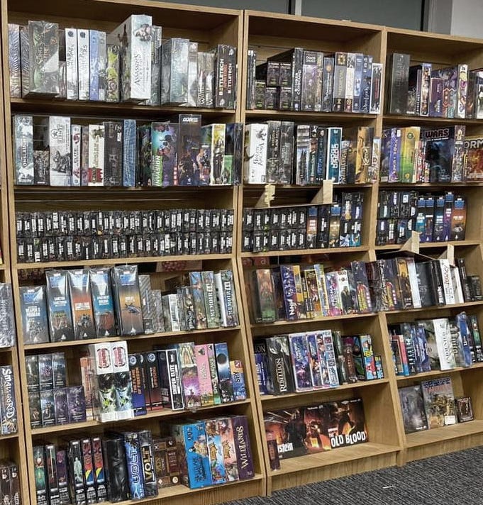
However, when I go to my Friendly Local Game Store, DUNGEON DEGENERATES still pops off the shelf & it’s the only one out of thousands. It’s been that way for almost ten years. I remember clearly going to Guardian Games with Katie & noting how all the games on the shelf stick to a muddy, desaturated palette. That’s still the trend.
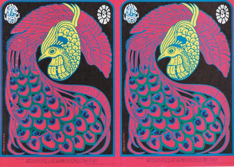
I was so visually starved & ultimately bored when I was growing up that the visual intensity of things like psychedelic gig posters & their throbbing colors worked on my young brain like drugs, even though I wouldn’t touch the stuff until my late teens.
I still have a traumatic response to being visually starved. The lack of visual interest reminds me of that pervasive gnawing boredom. Growing minds have a tremendous need for the unexpected, that challenge is absolutely necessary.
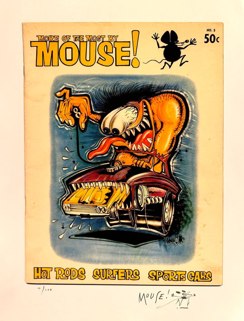
You can draw a direct line between the neon paint used by Weirdo Monster & Detroit Custom Car Culture father Stanley Mouse & how he took those things to the San Francisco Bay Area to be part of the 60s counter culture.
You can continue that lineage as the imagery soaked into my young brain via Museum shows of psychedelic posters & the use of those Weirdo Art standards in an enormous vein of 80s “gross-out” culture.
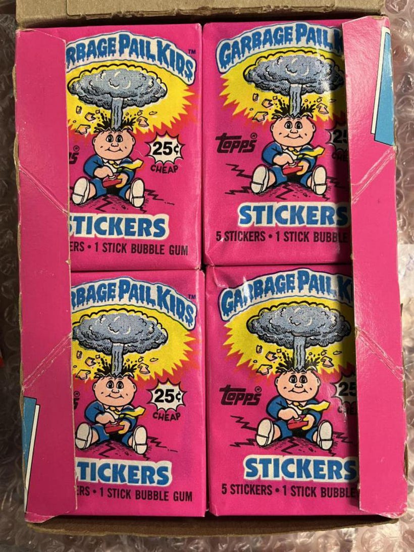
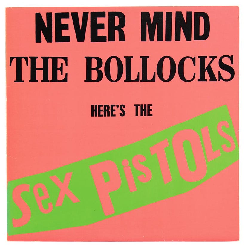
I’d argue that the bold pink used on the first series of Garbage Pail Kids cards in 1985 was as much influenced by the old Weirdo Art as it was by the pink of the Sex Pistols “Nevermind the Bollocks”.
Punk has always meant “a challenge” to me. While it obviously has its own structure, its own aesthetics, its own sound, its own way of life, at the core, the important thing is a willingness to challenge.
I’ve had a surprising number of stores & reviewers refuse to even give the game the time of day because of the name, arguing that their platform is only for “family friendly” games.
The content of the game is much more wholesome than “Cards Against Humanity” for example, which was being sold at Target the last time I checked.
The thing that is being avoided is a willingness to challenge. A willingness to entertain disruption - to be ready for the unexpected.
I’m sure you’ve seen those memes about color leaving our society. Cars being dominated by white & black, McDonalds going beige, all color being leached out of everything.
If I’ve learned anything over my life, it’s that the crowd can frequently be wrong. Especially if the crowd has no leadership that is declaring the importance of things being visually stunning.
Everything has been so up in the air & uncertain in society for the last… ten years that the place of control has moved to the places of consumer choice that are easiest to decide on. Boring, unadorned jackets & white cars with no bumper stickers have taken the place of societal standards.
If the common performance is to point out the non-blandness of a thing as a way of prefacing your enjoyment of it - stop that ritual & go for it straight away. No more apologizing. No more prefacing.
The world can be so much more exciting & visually charged, it doesn’t have to be that the go-to is mud. This extends beyond visuals into everything, things can be full of flavor. Things should be full of flavor.
x SEAN
Need more color in your life? Check out GOBLINKO, the home of the art I’ve produced since 1999.
Anyone who got to enjoy the 80s this was so great,to live it as things came out was a different feel and time,wish you would write a dark fantasy novel you have a wonderful way of making hooks that grab and donot let go,When lord Scrott was imbibing everything he could to reach his desired destination it was a read I will never forget,Thanks Sean
100%